kicksave856
Philadelphia Flyers |
|
 |
Location: i love how not saying dumb things on the internet was never an option.
Joined: 09.29.2005
|
|
|
|
to borrow a watsonism, he is one post away from being dead to me after him liking the canucks' retros and wondering why more teams don't use more gradient coloring.
- Gramps28
yeah that was crazy. |
|
mr.peanut
Vegas Golden Knights |
|
 |
Location: Born Wearing Gold 2023-24: 6-0-0, QC
Joined: 12.18.2011
|
|
|
|
Laffs lost ")
- habs88888
no no |
|
mr.peanut
Vegas Golden Knights |
|
|
Location: Born Wearing Gold 2023-24: 6-0-0, QC
Joined: 12.18.2011
|
|
|
|
to borrow a watsonism, he is one post away from being dead to me after him liking the canucks' retros and wondering why more teams don't use more gradient coloring.
- Gramps28
been warning everyone for years |
|
kicksave856
Philadelphia Flyers |
|
|
Location: i love how not saying dumb things on the internet was never an option.
Joined: 09.29.2005
|
|
|
|
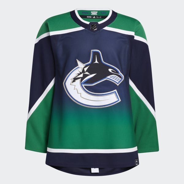
oh my, that's fugly
_Authentic_Pro_Jersey_Multi_GJ0599_01_laydown.jpg)
- Pat1993
 |
|
Pat1993
Montreal Canadiens |
|
 |
Location: disguise delimit, QC
Joined: 08.28.2009
|
|
|
|
no no
- mr.peanut
you must be stuck in an alternate reality again.
|
|
Gramps28
Chicago Blackhawks |
|
 |
Location: Double poop your best players everyone!, IL
Joined: 07.09.2014
|
|
|
|
oh my, that's fugly
- Pat1993
i admit i dislike those two colors together. the whalers came the closest to doing it well but even they had far better looking unis.
but only psychopaths like gradient colors on a uniform. |
|
mr.peanut
Vegas Golden Knights |
|
|
Location: Born Wearing Gold 2023-24: 6-0-0, QC
Joined: 12.18.2011
|
|
|
|
you must be stuck in an alternate reality again.
- Pat1993
much easier than what's actually going on |
|
deadpoulet
Montreal Canadiens |
|
 |
Location: Montreal
Joined: 07.01.2008
|
|
|
|
Flames leading Laffs nice !
- habs88888
Calgary could catch up on mtl, so not nice. |
|
kicksave856
Philadelphia Flyers |
|
|
Location: i love how not saying dumb things on the internet was never an option.
Joined: 09.29.2005
|
|
|
|
you must be stuck in an alternate reality again.
- Pat1993
 |
|
kicksave856
Philadelphia Flyers |
|
|
Location: i love how not saying dumb things on the internet was never an option.
Joined: 09.29.2005
|
|
|
|
i admit i am dislike those two colors together. the whalers came the closest to doing it well but even they had far better looking unis.
but only psychopaths like gradient colors on a uniform.
- Gramps28
the gradient, the angled stripes, i hate it.
and, as you know, i actually love that color combo, but not in those shades. brighter than that. |
|
Gramps28
Chicago Blackhawks |
|
|
Location: Double poop your best players everyone!, IL
Joined: 07.09.2014
|
|
|
|
been warning everyone for years
- mr.peanut
my reaction after seeing that
 |
|
deadpoulet
Montreal Canadiens |
|
|
Location: Montreal
Joined: 07.01.2008
|
|
|
|
oh my, that's fugly
- Pat1993
it's look good to me
not a huge fan of the logo but the colors are nice |
|
mr.peanut
Vegas Golden Knights |
|
|
Location: Born Wearing Gold 2023-24: 6-0-0, QC
Joined: 12.18.2011
|
|
|
|
my reaction after seeing that
- Gramps28
 |
|
Gramps28
Chicago Blackhawks |
|
|
Location: Double poop your best players everyone!, IL
Joined: 07.09.2014
|
|
|
|
the gradient, the angled stripes, i hate it.
and, as you know, i actually love that color combo, but not in those shades. brighter than that.
- kicksave856
i am ready for the whole, edgy angled stripe fad to be over. |
|
Pat1993
Montreal Canadiens |
|
|
Location: disguise delimit, QC
Joined: 08.28.2009
|
|
|
|
- kicksave856
 fixed!
 |
|
Pat1993
Montreal Canadiens |
|
|
Location: disguise delimit, QC
Joined: 08.28.2009
|
|
|
|
it's look good to me
not a huge fan of the logo but the colors are nice
- deadpoulet
I don't necessarily mind the color combination, but the gradient (it shouldn't be a thing lol) and the lines are all wrong. and that logo sucks too lol |
|
Gramps28
Chicago Blackhawks |
|
|
Location: Double poop your best players everyone!, IL
Joined: 07.09.2014
|
|
|
|
the gradient, the angled stripes, i hate it.
and, as you know, i actually love that color combo, but not in those shades. brighter than that.
- kicksave856
i like both colors but them together just never looks right to me. Maybe because both are used as primary-ish colors and it looks like someone can't make up their minds about which way to go. |
|
Pat1993
Montreal Canadiens |
|
|
Location: disguise delimit, QC
Joined: 08.28.2009
|
|
|
|
the gradient, the angled stripes, i hate it.
and, as you know, i actually love that color combo, but not in those shades. brighter than that.
- kicksave856
exactly, agreed 1000%.
|
|
Gramps28
Chicago Blackhawks |
|
|
Location: Double poop your best players everyone!, IL
Joined: 07.09.2014
|
|
|
|
it's look good to me
not a huge fan of the logo but the colors are nice
- deadpoulet
explains a lot
 |
|
kicksave856
Philadelphia Flyers |
|
|
Location: i love how not saying dumb things on the internet was never an option.
Joined: 09.29.2005
|
|
|
|
fixed!
- Pat1993
|
|
kicksave856
Philadelphia Flyers |
|
|
Location: i love how not saying dumb things on the internet was never an option.
Joined: 09.29.2005
|
|
|
|
exactly, agreed 1000%.
- Pat1993
*low fives* |
|
Pat1993
Montreal Canadiens |
|
|
Location: disguise delimit, QC
Joined: 08.28.2009
|
|
|
|
i like both colors but them together just never looks right to me. Maybe because both are used as primary-ish colors and it looks like someone can't make up their minds about which way to go.
- Gramps28
maybe you can't make up YOUR mind...
|
|
deadpoulet
Montreal Canadiens |
|
|
Location: Montreal
Joined: 07.01.2008
|
|
|
|
explains a lot
- Gramps28
what? |
|
habs88888
Montreal Canadiens |
|
Joined: 12.28.2018
|
|
|
|
Calgary could catch up on mtl, so not nice.
- deadpoulet
Mtl will get their poop together but it’s always good to see the Laffs lose
|
|
Gramps28
Chicago Blackhawks |
|
|
Location: Double poop your best players everyone!, IL
Joined: 07.09.2014
|
|
|
|
maybe you can't make up YOUR mind...
- Pat1993
no, i know i hate that color combo.
|
|


