NewYorkNuck
Vancouver Canucks |
|
 |
Location: New York, NY
Joined: 07.11.2015
|
|
|
|
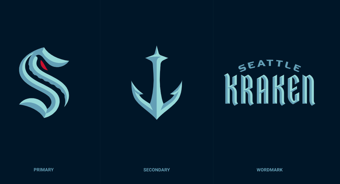
Kraken it is...

- WhiteLie
Not a bad logo – simple, clean. Not going to generate much hate towards it, but feel they could have done more. |
|
WhiteLie
Referee
|
|
 |
Location: When youre 7 pages behind Dont bother catching up, you will never get that time back - Codes1087
Joined: 07.26.2010
|
|
|
|
Should’ve been Metropolitans... But Kraken will sell merch to this generation of gamers & mumble rap fans. Their colour scheme is garbage 😴... Primary logo 👎🏽. Secondary logo 👍🏽.
- DrChristianTroy
Secondary logo was well done. I don't mind the primary either, its simple enough to have longevity. Could've been much worse |
|
NewYorkNuck
Vancouver Canucks |
|
|
Location: New York, NY
Joined: 07.11.2015
|
|
|
|
Team sponsors
 |
|
|
|
|
VanHockeyGuy
|
|
 |
Location: “Who are we to think we’re anybody?” - Tocchet. Penticton, BC
Joined: 04.26.2012
|
|
|
|
Just watched the Seattle Kraken announcement. Great logo, presentation. I like it. 
 |
|
WhiteLie
Referee
|
|
|
Location: When youre 7 pages behind Dont bother catching up, you will never get that time back - Codes1087
Joined: 07.26.2010
|
|
|
|
Not a bad logo – simple, clean. Not going to generate much hate towards it, but feel they could have done more.
- NewYorkNuck
That's my general feeling with Kraken as a brand, I had the same disappointment when Vegas went with Knights. It'll grow on me I figure |
|
VanHockeyGuy
|
|
|
Location: “Who are we to think we’re anybody?” - Tocchet. Penticton, BC
Joined: 04.26.2012
|
|
|
|
Not a bad logo – simple, clean. Not going to generate much hate towards it, but feel they could have done more.
- NewYorkNuck
I think it's great, clean, modern and simple.
|
|
bloatedmosquito
Vancouver Canucks |
|
 |
Location: I’m a dose of reality in this cesspool of glee
Joined: 10.22.2011
|
|
|
|
The fans designs will be fun. The Krack heads and the Krack house.
- VANTEL
Yeah, I was just going to repost that guys tweet
Fans will forever be the Krak-heads. The arena the Krak-house.
I thought that was clever. |
|
WhiteLie
Referee
|
|
|
Location: When youre 7 pages behind Dont bother catching up, you will never get that time back - Codes1087
Joined: 07.26.2010
|
|
|
bloatedmosquito
Vancouver Canucks |
|
|
Location: I’m a dose of reality in this cesspool of glee
Joined: 10.22.2011
|
|
|
|
I think it's great, clean, modern and simple.
- VanHockeyGuy
The white jerseys are horrendous though. Hate that powder blue colour. Kind of like the penguins alternate blue jersey. Yuk. |
|
VanHockeyGuy
|
|
|
Location: “Who are we to think we’re anybody?” - Tocchet. Penticton, BC
Joined: 04.26.2012
|
|
|
|
The fans designs will be fun. The Krack heads and the Krack house.
- VANTEL
Krack Whore ") ") |
|
Marwood
|
|
 |
Location: Cumberland, BC
Joined: 03.18.2010
|
|
|
|
Should’ve been Metropolitans... But Kraken will sell merch to this generation of gamers & mumble rap fans. Their colour scheme is garbage 😴... Primary logo 👎🏽. Secondary logo 👍🏽.
- DrChristianTroy
 |
|
belcherbd
Vancouver Canucks |
|
 |
Location: Nanaimo
Joined: 02.16.2007
|
|
|
|
Should’ve been Metropolitans... But Kraken will sell merch to this generation of gamers & mumble rap fans. Their colour scheme is garbage 😴... Primary logo 👎🏽. Secondary logo 👍🏽.
- DrChristianTroy
Krakens is a garbage name but slight better than Golden Knights. |
|
VanHockeyGuy
|
|
|
Location: “Who are we to think we’re anybody?” - Tocchet. Penticton, BC
Joined: 04.26.2012
|
|
|
|
The white jerseys are horrendous though. Hate that powder blue colour. Kind of like the penguins alternate blue jersey. Yuk.
- bloatedmosquito
I'm tired of the whale. |
|
Marwood
|
|
|
Location: Cumberland, BC
Joined: 03.18.2010
|
|
|
|
I'm tired of the whale.
- VanHockeyGuy
|
|
VanHockeyGuy
|
|
|
Location: “Who are we to think we’re anybody?” - Tocchet. Penticton, BC
Joined: 04.26.2012
|
|
|
|
Full logo set.
 |
|
NuckUp
Vancouver Canucks |
|
 |
Location: Cap Busters
Joined: 07.01.2019
|
|
|
|
Not a bad logo – simple, clean. Not going to generate much hate towards it, but feel they could have done more.
- NewYorkNuck
Canucks need to generate the hate for the new rival to arrive with a team loaded to compete now. |
|
WhiteLie
Referee
|
|
|
Location: When youre 7 pages behind Dont bother catching up, you will never get that time back - Codes1087
Joined: 07.26.2010
|
|
|
|
The white jerseys are horrendous though. Hate that powder blue colour. Kind of like the penguins alternate blue jersey. Yuk.
- bloatedmosquito
The white one reminds me of the white/navy Orca Bay era Canuck jerseys |
|
bloatedmosquito
Vancouver Canucks |
|
|
Location: I’m a dose of reality in this cesspool of glee
Joined: 10.22.2011
|
|
|
|
I'm tired of the whale.
- VanHockeyGuy
100%. Does anybody actually like it? |
|
VanHockeyGuy
|
|
|
Location: “Who are we to think we’re anybody?” - Tocchet. Penticton, BC
Joined: 04.26.2012
|
|
|
|
Canucks need to generate the hate for the new rival to arrive with a team loaded to compete now.
- NuckUp
I've always supported Seattle teams. |
|
VanHockeyGuy
|
|
|
Location: “Who are we to think we’re anybody?” - Tocchet. Penticton, BC
Joined: 04.26.2012
|
|
|
|
100%. Does anybody actually like it?
- bloatedmosquito
It was the old orca bay brand, they sold years ago. Time for an update.
|
|
bloatedmosquito
Vancouver Canucks |
|
|
Location: I’m a dose of reality in this cesspool of glee
Joined: 10.22.2011
|
|
|
|
The white one reminds me of the white/navy Orca Bay era Canuck jerseys
- WhiteLie
Canucks fans more than anyone know an ugly jersey when they see it. We’ve had too many to list. |
|
WhiteLie
Referee
|
|
|
Location: When youre 7 pages behind Dont bother catching up, you will never get that time back - Codes1087
Joined: 07.26.2010
|
|
|
|
100%. Does anybody actually like it?
- bloatedmosquito
I don't hate it or love it, but given the success (IMO) Adidas/NHL has had recently with Vegas and Seattle's logos I'd be really interested to see what they could come up with for Vancouver |
|
Marwood
|
|
|
Location: Cumberland, BC
Joined: 03.18.2010
|
|
|
|
I don't hate it or love it, but given the success (IMO) Adidas/NHL has had recently with Vegas and Seattle's logos I'd be really interested to see what they could come up with for Vancouver
- WhiteLie
I don't, go back to the stick in rink. |
|
Codes1087
Vancouver Canucks |
|
 |
Joined: 09.24.2014
|
|
|
|
I've always supported Seattle teams.
- VanHockeyGuy
The space needle anchor was really well done. I like it more than their main logo |
|


