BeadyEyedDouche
Buffalo Sabres |
|
 |
Location: Rustmine Ramsum most exciting Sabres klugdragger since Taro Tsujimoto
Joined: 07.01.2016
|
|
|
|
Yeah, that's because they're not allowed to change full-time yet, because of stupid rules, so it looks weird when they wear the normal dark jerseys.
- Wetbandit1
They have been mis-matched since at least the mid-90's, possibly even the entire decade:
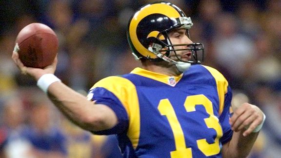
And
 |
|
BeadyEyedDouche
Buffalo Sabres |
|
|
Location: Rustmine Ramsum most exciting Sabres klugdragger since Taro Tsujimoto
Joined: 07.01.2016
|
|
|
|
I really hope when the Rams switch jerseys next year they go with the ones they're wearing today. The best jerseys in the league aside from the Chargers powder blues.
- Wetbandit1
The Raiders, Steelers, Packers and current Bills uniforms are all top-5 IMO.
1.) Raiders
2.) Steelers
3.) Packers
4.) Bears
5.) Bills
Not including throwback or alternates. |
|
Wetbandit1
Vegas Golden Knights |
|
 |
Location: Hail Satan
Joined: 10.07.2010
|
|
|
|
They already said it's getting put off another year and they're going back to the white and navy color-scheme. They want the new jerseys to start with the new stadium, when it's finished.
- BeadyEyedDouche
That makes sense, I wasn't really following it, but I remember they had to wait 2 years. |
|
Wetbandit1
Vegas Golden Knights |
|
|
Location: Hail Satan
Joined: 10.07.2010
|
|
|
|
They have been mis-matched since at least the mid-90's, possibly even the entire decade:
And
- BeadyEyedDouche
Different materials will show the same color differently depending on the light, one pic was in a dome, one was sunlight, presumably different cameras, different computers edited the photo. Kind of like how the Sabres away whites look almost gray on TV in certain arenas.
And that's not the mismatch he was talking about. The white horn navy background helmets with the navy and gold with tiny white stripe jerseys.
|
|
jdfitz77
Buffalo Sabres |
|
 |
Location: buffalo, NY
Joined: 05.21.2007
|
|
|
|
They have been mis-matched since at least the mid-90's, possibly even the entire decade:
And
- BeadyEyedDouche
Right
And it looks dumb |
|
jdfitz77
Buffalo Sabres |
|
|
Location: buffalo, NY
Joined: 05.21.2007
|
|
|
|
Different materials will show the same color differently depending on the light, one pic was in a dome, one was sunlight, presumably different cameras, different computers edited the photo. Kind of like how the Sabres away whites look almost gray on TV in certain arenas.
And that's not the mismatch he was talking about. The white horn navy background helmets with the navy and gold with tiny white stripe jerseys.
- Wetbandit1
I was talking about the 2 different blues not matching up
In the above pic,
i like that they’re the same shade of blue
The white in the helmets doesn’t match up with the gold in the jerseys though,
so that looks weird too |
|
Wetbandit1
Vegas Golden Knights |
|
|
Location: Hail Satan
Joined: 10.07.2010
|
|
|
|
I was talking about the 2 different blues not matching up
In the above pic,
i like that they’re the same shade of blue
The white in the helmets doesn’t match up with the gold in the jerseys though,
so that looks weird too
- jdfitz77
It's not, the helmet appears darker. If you're going to compare the other ones not matching, neither is distracting like the white and blue helmet with gold on the jersey, that clashes horribly. Colors also wash out of fabrics slightly, so that's going to make jerseys seem lighter as well. Now when hockey players on the same team have different shades, of blue usually, that's annoying. There's no such thing as matching a color unless it all comes from the same batch. Even watching the WS the blue of the Sox helmets doesn't quite match the blue on the jersey. The helmet appears darker. The red too for that matter. |
|
jdfitz77
Buffalo Sabres |
|
|
Location: buffalo, NY
Joined: 05.21.2007
|
|
|
|
It's not, the helmet appears darker. If you're going to compare the other ones not matching, neither is distracting like the white and blue helmet with gold on the jersey, that clashes horribly. Colors also wash out of fabrics slightly, so that's going to make jerseys seem lighter as well. Now when hockey players on the same team have different shades, of blue usually, that's annoying. There's no such thing as matching a color unless it all comes from the same batch. Even watching the WS the blue of the Sox helmets doesn't quite match the blue on the jersey. The helmet appears darker. The red too for that matter.
- Wetbandit1
The dark blue & the regular blue are clearly 2 different shades
The color on the jerseys didn’t “wash out”
U can see in the pic u posted how the 2 blues match pretty closely
Looks much better
The Boston helmets & jerseys are at least close |
|
Wetbandit1
Vegas Golden Knights |
|
|
Location: Hail Satan
Joined: 10.07.2010
|
|
|
|
The dark blue & the regular blue are clearly 2 different shades
The color on the jerseys didn’t “wash out”
U can see in the pic u posted how the 2 blues match pretty closely
Looks much better
The Boston helmets & jerseys are at least close
- jdfitz77
The point is you're splitting hairs. The new blue and yellow blue is only slightly more off than the other examples I gave, noticeable, yes, but most of the time the camera isn't close enough to notice anyway, and when it is, it's noticeable on all of them. |
|
Wetbandit1
Vegas Golden Knights |
|
|
Location: Hail Satan
Joined: 10.07.2010
|
|
|
|
|
How does Price not win the MVP? 3 appearances in 5 games including 2 starts, and he was up for the game yesterday but didn't have to come in. |
|
Der Kaiser
Buffalo Sabres |
|
 |
Location: I Know Nothink ... NOTHINK!
Joined: 07.27.2007
|
|
|
Der Kaiser
Buffalo Sabres |
|
|
Location: I Know Nothink ... NOTHINK!
Joined: 07.27.2007
|
|
|
|
I'm still drunk
- jochfr
This was runner up.
|
|
seedy
Buffalo Sabres |
|
 |
Location: you don't need an ignore button to ignore someone., CA
Joined: 02.22.2007
|
|
|
Wetbandit1
Vegas Golden Knights |
|
|
Location: Hail Satan
Joined: 10.07.2010
|
|
|
|
This was the only post worth reading all day long.
- Der Kaiser
That makes it a pretty special day when one post is worth reading. |
|
mhp
Buffalo Sabres |
|
 |
Location: PROUD MEMBER OF RED SOX NATION SINCE 1975!!!! , SD
Joined: 01.14.2008
|
|
|
|
How does Price not win the MVP? 3 appearances in 5 games including 2 starts, and he was up for the game yesterday but didn't have to come in.
- Wetbandit1
I think it could go to Pearce, as long as we wrap it up tonight, all that matters. Getting it done with the long ball off Kershaw. Fantastic stuff. |
|
Wetbandit1
Vegas Golden Knights |
|
|
Location: Hail Satan
Joined: 10.07.2010
|
|
|
|
I think it could go to Pearce, as long as we wrap it up tonight, all that matters. Getting it done with the long ball off Kershaw. Fantastic stuff.
- mhp
A distinct possibility. I just think that with how pitchers are used today, once in a while when they really need a guy they'll use him on 3 days rest, but Price has either pitched or been warming up(which is enough to reset a guy's place in the rotation at times) in 4 of the 5 games so far is awesome in the truest sense of the word. |
|
jdfitz77
Buffalo Sabres |
|
|
Location: buffalo, NY
Joined: 05.21.2007
|
|
|
|
The point is you're splitting hairs. The new blue and yellow blue is only slightly more off than the other examples I gave, noticeable, yes, but most of the time the camera isn't close enough to notice anyway, and when it is, it's noticeable on all of them.
- Wetbandit1
U don’t think the blue on the jerseys & the blue in the helmets is noticeable?
I think it’s very, very noticeable
U talking about the difference in Boston is splitting hairs
This pic at the top of the page that Beady posted is WAY off from each other
And it looks dumb |
|
Wetbandit1
Vegas Golden Knights |
|
|
Location: Hail Satan
Joined: 10.07.2010
|
|
|
|
U don’t think the blue on the jerseys & the blue in the helmets is noticeable?
I think it’s very, very noticeable
U talking about the difference in Boston is splitting hairs
This pic at the top of the page that Beady posted is WAY off from each other
And it looks dumb
- jdfitz77
That's not what I said. I said it's only slightly more noticeable than the other examples. And like I also said there is no such thing as a color match; especially when you're dealing with different manufacturers, like New Era and Mizuno. The Red Sox caps and helmets are very noticeably different, the Dodgers as well. None of them are enough to be distracting unless you're specifically looking for it.
Edit: I see at least 3 different color helmets there. That is way worse than a helmet/cap jersey mismatch, at least those are consistent.
 |
|
BeadyEyedDouche
Buffalo Sabres |
|
|
Location: Rustmine Ramsum most exciting Sabres klugdragger since Taro Tsujimoto
Joined: 07.01.2016
|
|
|
|
Different materials will show the same color differently depending on the light, one pic was in a dome, one was sunlight, presumably different cameras, different computers edited the photo.
- Wetbandit1
Yes and no
They matched better in the 80's:
And:

You can see, it's mostly a manufacturer issue when the NFL switched to Starter Uniforms in the 1990's, which were made of a lighter, cheaper material. |
|
Wetbandit1
Vegas Golden Knights |
|
|
Location: Hail Satan
Joined: 10.07.2010
|
|
|
|
Yes and no
They matched better in the 80's:
And:
You can see, it's mostly a manufacturer issue when the NFL switched to Starter Uniforms in the 1990's, which were made of a lighter, cheaper material.
- BeadyEyedDouche
That was the first thing I said.
|
|
BeadyEyedDouche
Buffalo Sabres |
|
|
Location: Rustmine Ramsum most exciting Sabres klugdragger since Taro Tsujimoto
Joined: 07.01.2016
|
|
|
|
That was the first thing I said.
- Wetbandit1
Yeah I was more or less affirming your statement with more examples. But I'm almost positive the current throwback is mis-matched on purpose to resemble the Super Bowl title uniforms that Warner and co. wore in 1999 |
|
Wetbandit1
Vegas Golden Knights |
|
|
Location: Hail Satan
Joined: 10.07.2010
|
|
|
|
Yeah I was more or less affirming your statement with more examples. But I'm almost positive the current throwback is mis-matched on purpose to resemble the Super Bowl title uniforms that Warner and co. wore in 1999
- BeadyEyedDouche
It's certainly possible. And with the new fabrics reflecting more light and appearing shiny, the color is going to lighten up some too.
God, when is the next Sabres game already! |
|
jdfitz77
Buffalo Sabres |
|
|
Location: buffalo, NY
Joined: 05.21.2007
|
|
|
|
Yes and no
They matched better in the 80's:
And:
You can see, it's mostly a manufacturer issue when the NFL switched to Starter Uniforms in the 1990's, which were made of a lighter, cheaper material.
- BeadyEyedDouche
That’s what I’m saying
The above look CLOSE
The below is not at all
|
|
jdfitz77
Buffalo Sabres |
|
|
Location: buffalo, NY
Joined: 05.21.2007
|
|
|
|
That's not what I said. I said it's only slightly more noticeable than the other examples. And like I also said there is no such thing as a color match; especially when you're dealing with different manufacturers, like New Era and Mizuno. The Red Sox caps and helmets are very noticeably different, the Dodgers as well. None of them are enough to be distracting unless you're specifically looking for it.
Edit: I see at least 3 different color helmets there. That is way worse than a helmet/cap jersey mismatch, at least those are consistent.
- Wetbandit1
If u think the color difference ABOVE is anywhere close to the color difference below,
then you’ve gotta get your eyes checked sir
It’s WAY, WAY off |
|
Wetbandit1
Vegas Golden Knights |
|
|
Location: Hail Satan
Joined: 10.07.2010
|
|
|
|
If u think the color difference ABOVE is anywhere close to the color difference below,
then you’ve gotta get your eyes checked sir
It’s WAY, WAY off
- jdfitz77
You seriously need to learn how to read.
The fact that the helmets of players on the same team are different colors is more annoying than the mismatch between helmet/cap and jerseys, while greater in contrast, is at least consistent throughout the team. |
|


