LeftCoaster
|
|
 |
Location: Valley Of The Sun, AZ
Joined: 07.03.2009
|
|
|
|
The modified Stick n Rink, everything else blows  |
|
LordHumungous
Vancouver Canucks |
|
 |
Location: Greetings from the Humungous. Ayatollah of rock and rolla!
Joined: 08.15.2014
|
|
|
|
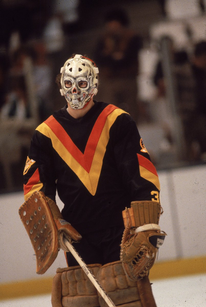
The stick in rink is boxy and it shows nothing unique to Van. It's so boring
- NorthNuck
Flyers and Habs logos are boring too, Detroit has a wheel and a wing FFS...but they work. Much like the Stick n Rink does especially the modified version. Sometimes simpler is better bro. ") |
|
LordHumungous
Vancouver Canucks |
|
|
Location: Greetings from the Humungous. Ayatollah of rock and rolla!
Joined: 08.15.2014
|
|
|
|
The modified Stick n Rink, everything else blows
- LeftCoaster
True dat |
|
Marwood
Vancouver Canucks |
|
 |
Location: Cumberland, BC
Joined: 03.18.2010
|
|
|
|
You'll change your mind when Demko goes all in on style points and has a replica mask painted for the occasion...
- WhiteLie
I have no good memories of that atrocity of a uniform. Hideous. |
|
Marwood
Vancouver Canucks |
|
|
Location: Cumberland, BC
Joined: 03.18.2010
|
|
|
|
The modified Stick n Rink, everything else blows
- LeftCoaster
|
|
Nighthawk
Vancouver Canucks |
|
Location: Canuckville, BC
Joined: 01.09.2015
|
|
|
|
The stick in rink is boxy and it shows nothing unique to Van. It's so boring
- NorthNuck
Is Johnny Canuck from the WHL days better? |
|
Nighthawk
Vancouver Canucks |
|
Location: Canuckville, BC
Joined: 01.09.2015
|
|
|
|
Flyers and Habs logos are boring too, Detroit has a wheel and a wing FFS...but they work. Much like the Stick n Rink does especially the modified version. Sometimes simpler is better bro.
- LordHumungous
Flyers have the longest standing fugly jersey of all time. |
|
NorthNuck
Vancouver Canucks |
|
 |
Location: Yellowknife, NWT
Joined: 05.30.2016
|
|
|
|
Flyers and Habs logos are boring too, Detroit has a wheel and a wing FFS...but they work. Much like the Stick n Rink does especially the modified version. Sometimes simpler is better bro.
- LordHumungous
I don't really disagree, simple is good, for example I think VGK got it right with their logo.
I just think the stick in rink is  I don't like how boxy it is |
|
|
|
|
|
I don't really disagree, simple is good, for example I think VGK got it right with their logo.
I just think the stick in rink is I don't like how boxy it is
- NorthNuck
I don't like the VGN uniforms or logos |
|
Codes1087
Vancouver Canucks |
|
 |
Joined: 09.24.2014
|
|
|
|
The modified Stick n Rink, everything else blows
- LeftCoaster
I would be ecstatic if we never saw the stupid orca whale ever again. Modified stick in the rink with the blue and green color scheme has and always will be my favorite. I actually dislike the black/red/yellow theme and the logos it shared. |
|
Codes1087
Vancouver Canucks |
|
|
Joined: 09.24.2014
|
|
|
|
I never liked any Canuck jersey TBH. They all look like they have been designed by someone that was mentally challenged or a 6 year old.
- VANTEL
Everything outside the original i havent been a huge fan of. I loved the white (stick in the rink) jersey, with the blue and green colors, that the canucks used when they played the LA kings in their old gold unis. The one with the V shape in their sleeves. I would love if they adopted those as full time jerseys
https://goo.gl/images/e5tpb7
|
|
|
|
|
|
|
Dylan Cozens climbing the charts 6'3 RHC |
|
Nighthawk
Vancouver Canucks |
|
Location: Canuckville, BC
Joined: 01.09.2015
|
|
|
|
Dylan Cozens climbing the charts 6'3 RHC
- VANTEL
I’ve liked what i’ve seen of him so far |
|
Marwood
Vancouver Canucks |
|
|
Location: Cumberland, BC
Joined: 03.18.2010
|
|
|
|
I would be ecstatic if we never saw the stupid orca whale ever again. Modified stick in the rink with the blue and green color scheme has and always will be my favorite. I actually dislike the black/red/yellow theme and the logos it shared.
- Codes1087
|
|
hillbillydeluxe
Vancouver Canucks |
|
 |
Location: I didn't read it , BC
Joined: 09.21.2013
|
|
|
|
Everything outside the original i havent been a huge fan of. I loved the white (stick in the rink) jersey, with the blue and green colors, that the canucks used when they played the LA kings in their old gold unis. The one with the V shape in their sleeves. I would love if they adopted those as full time jerseys
https://goo.gl/images/e5tpb7
- Codes1087
nice
|
|
manvanfan
Vancouver Canucks |
|
 |
Location: MB
Joined: 01.21.2012
|
|
|
|
Dylan Cozens climbing the charts 6'3 RHC
- VANTEL
Peyton Krebs reminds me of Jake Debrusk. |
|
|
|
|
|
Peyton Krebs reminds me of Jake Debrusk.
- manvanfan
Debrusk will kick Barzals ass in playoff goals in his career  |
|
Nighthawk
Vancouver Canucks |
|
Location: Canuckville, BC
Joined: 01.09.2015
|
|
|
|
Debrusk will kick Barzals ass in playoff goals in his career
- VANTEL
I’ll take Barzal anyday |
|
DariusKnight
Vancouver Canucks |
|
 |
Location: "The Alien has landed in Vancouver!"
Joined: 03.09.2006
|
|
|
|
|
Personally I'd like to see a whole new logo for our 50th anniversary season, none of the ones we have and had look good. The "Stick n' Rink" is so minimalist that it's not even a logo, the "Flying V" is an atrocity to look at, the "Flaming Skate" isn't much better and the less said about the Orca and the Vancouver over it, the better.
Why not Johnny Canuck or maybe a stylized version of the cityscape. |
|
|
|
|
|
Personally I'd like to see a whole new logo for our 50th anniversary season, none of the ones we have and had look good. The "Stick n' Rink" is so minimalist that it's not even a logo, the "Flying V" is an atrocity to look at, the "Flaming Skate" isn't much better and the less said about the Orca and the Vancouver over it, the better.
Why not Johnny Canuck or maybe a stylized version of the cityscape.
- DariusKnight
 |
|
manvanfan
Vancouver Canucks |
|
|
Location: MB
Joined: 01.21.2012
|
|
|
NorthNuck
Vancouver Canucks |
|
|
Location: Yellowknife, NWT
Joined: 05.30.2016
|
|
|
|
I don't like the VGN uniforms or logos
- VANTEL
The colours aren't great but i like the logo. |
|
|
|
|
|
Only because Debrusk will have played triple the amount of playoff games then Barzal. 
- manvanfan
That is a fact ") |
|
K-man25
Calgary Flames |
|
 |
Location: Sayulita
Joined: 09.02.2014
|
|
|
|
I like the modernized stick in rink, and prefer the flying V over the orca.
bring back the spaghetti instead of the orca. 
- hillbillydeluxe
I like mine best! Just kidding! |
|
|
|
|
|
The colours aren't great but i like the logo.
- NorthNuck
For a city with great imagination I think they fell short on the whole marketing idea. It is a very modern forward thinking city with an old dull theme. |
|


