Ogilthorpe2
Season Ticket Holder
Chicago Blackhawks |
|
 |
Location: 37,000 FT
Joined: 07.09.2009
|
|
|
|
Fair enough on most points... saying anything post 75 blows is pretty foolish though. The history of a logo is certainly relevant. But just because teams come into being after the original six, doesn;t mean their logos can't be cooler. I love the skating penguin (I AM a pens fan so homerism can definately be present) and the sharks logo was an instant hit. the wilds new logo is damn cool. One could argue your logo is slightly insulting, but I for one am not one of them. Those people are just a bit to sensitive. Several logos, including from the teams I listed above wont lose their luster after ten years. period. ")
- ChrisMS
No.
Their 3rd jersey...awesome, standard home dark...brutal. |
|
|
|
|
|
No.
- Ogilthorpe2
after reading you god awful list I can see we are going to have to agree to disagree. NHL hockey rocks! WOOOOOO!!!!!!!!! |
|
Ogilthorpe2
Season Ticket Holder
Chicago Blackhawks |
|
|
Location: 37,000 FT
Joined: 07.09.2009
|
|
|
|
after reading your spot on list I can see we are going to be the best of friends. NHL hockey rocks! WOOOOOO!!!!!!!!!
- ChrisMS
Fixed. |
|
ArlingtonRob
Chicago Blackhawks |
|
 |
Location: 230 years was a good run, IL
Joined: 01.20.2012
|
|
|
|
that logo is awesome fool! name, meh. But great design on the logo
- ChrisMS
The Wild? This is an example of how personal taste varies...
I like the colors, and the sweater with MINNESOTA across the chest is great...but the logo is not good in my opinion.
But it ain't my team so I don't get too worked up about it. |
|
Ogilthorpe2
Season Ticket Holder
Chicago Blackhawks |
|
|
Location: 37,000 FT
Joined: 07.09.2009
|
|
|
|
that logo is awesome fool! name, meh. But great design on the logo
- ChrisMS
Hideous...

Awesome...
 |
|
ArlingtonRob
Chicago Blackhawks |
|
|
Location: 230 years was a good run, IL
Joined: 01.20.2012
|
|
|
|
Hideous...
Awesome...
- Ogilthorpe2
I'll say this much about the bear head, it was a creative idea. I just don't think it works...
The NHL should have NEVER allowed the Northstars to leave Minnesota...especially for Texas...a state that doesn't deserve an NHL team, let alone one from the "state of hockey". Why didn't they just grant Dallas an expansion team?
That was not the best of moments for the NHL. |
|
EKB13
Chicago Blackhawks |
|
 |
Location: IL
Joined: 07.18.2009
|
|
|
|
I'll say this much about the bear head, it was a creative idea. I just don't think it works...
- ArlingtonRob
I agree with you Rob. The bear head was a creative idea, but you're right, it doesn't work. |
|
GioRock
New York Rangers |
|
 |
Location: Teaneck, NJ
Joined: 03.02.2009
|
|
|
|
Based on Darks only, with no consideration for 3rd's...
30) Minnesota (props for unique colors...horrible name and logo...bad)
29) Nashville (urine yellow....nothing else need be said)
28) Winnepeg (No.)
27) Carolina (OK logo, unimaginative color choices.)
26) Dallas (bad since the move from Minny, what's wrong with green and gold?)
25) Colorado (dumb name, semi unique colors...meh)
24) San Jose (unique colors are good, ugly colors are just....ugly)
23) Columbus (boring)
22) New Jersey (would be much higher if they brought the green back)
21) Anaheim (nothing special, but sooooo much better than eggplant and teal)
20) LA (also would be higher if they brought back the Yellow/Purple)
19) Ottawa (see Columbus)
18) Florida (major props for unique color combo)
17) Phoenix (can't go wrong with red)
16) Washington (retro-classic)
15) Tampa (ditched the black...good job)
14) NYI (same as it ever was...except for the unfortunate Gorton's Fisherman incident)
13) Calgary (need to permanently ditch the black...do it, do it.)
12) Pittsburgh (go back to Blue...please, not every team in Pit needs to be black and gold)
11) Vancouver (great colors, logo so bad it's good...the rink "C" not the Orca)
10) St. Louis (they just look right)
9) Buffalo (glad they also went back to their roots...looking at you Jersey and LA)
8) Edmonton (classic logo, love the way Orange pops on the white backdrop)
7) Philly (ditto)
6) Toronto (cool, especially with the retro Leaf)
5) Detroit (classic)
4) NYR (Logo? We don't need no stinking logo.)
3) Boston (great logo, great colors, love the shoulder patches too.)
2) Montreal (iconic)
1) Chicago (most colorful logo, classic striping, best shoulder patches, SC Champs!)
- Ogilthorpe2
What's interesting about the Rangers, is that they have a logo, a nice looking shield, but it's nowhere on the jersey 
Agree, though, hawks jersey is nice, classic |
|
wiz1901
Chicago Blackhawks |
|
 |
Location: DraftSite com, IL
Joined: 05.14.2008
|
|
|
|
I agree with you Rob. The bear head was a creative idea, but you're right, it doesn't work.
- EKolb13
And all this time, I thought it was a wild mouse...timid like the team...
|
|
|
|
|
|
Fixed.
- Ogilthorpe2

|
|
|
|
|
|
I'll say this much about the bear head, it was a creative idea. I just don't think it works...
The NHL should have NEVER allowed the Northstars to leave Minnesota...especially for Texas...a state that doesn't deserve an NHL team, let alone one from the "state of hockey". Why didn't they just grant Dallas an expansion team?
That was not the best of moments for the NHL.
- ArlingtonRob
I beg to disagree with the doesn't deserve a team. When they were winning they sold out. Teams in non-traditional markets need to be given a decent amount of time to build a fan base... about a generation after the move. They build it by winning.... Nill will have that team turned around real soon and they will be a viable team again. I do agree moving a team out of minny wasn't ideal though |
|
DaCincyKid
Chicago Blackhawks |
|
Location: KY
Joined: 08.03.2013
|
|
|
|
|
Kinda surprised no mention of Chelsea Dagger? Sure, not everyone likes it, but it always means something awesome just happened and the start of a great celebration.... Whether it be an overtime winner or a short handed laugher. Also kinda signifies the Hawks resurgence and two cup winners... |
|
DK002
Chicago Blackhawks |
|
 |
Location: Evanston, IL
Joined: 06.12.2012
|
|
|
|
Based on Darks only, with no consideration for 3rd's...
30) Minnesota (props for unique colors...horrible name and logo...bad)
29) Nashville (urine yellow....nothing else need be said)
28) Winnepeg (No.)
27) Carolina (OK logo, unimaginative color choices.)
26) Dallas (bad since the move from Minny, what's wrong with green and gold?)
25) Colorado (dumb name, semi unique colors...meh)
24) San Jose (unique colors are good, ugly colors are just....ugly)
23) Columbus (boring)
22) New Jersey (would be much higher if they brought the green back)
21) Anaheim (nothing special, but sooooo much better than eggplant and teal)
20) LA (also would be higher if they brought back the Yellow/Purple)
19) Ottawa (see Columbus)
18) Florida (major props for unique color combo)
17) Phoenix (can't go wrong with red)
16) Washington (retro-classic)
15) Tampa (ditched the black...good job)
14) NYI (same as it ever was...except for the unfortunate Gorton's Fisherman incident)
13) Calgary (need to permanently ditch the black...do it, do it.)
12) Pittsburgh (go back to Blue...please, not every team in Pit needs to be black and gold)
11) Vancouver (great colors, logo so bad it's good...the rink "C" not the Orca)
10) St. Louis (they just look right)
9) Buffalo (glad they also went back to their roots...looking at you Jersey and LA)
8) Edmonton (classic logo, love the way Orange pops on the white backdrop)
7) Philly (ditto)
6) Toronto (cool, especially with the retro Leaf)
5) Detroit (classic)
4) NYR (Logo? We don't need no stinking logo.)
3) Boston (great logo, great colors, love the shoulder patches too.)
2) Montreal (iconic)
1) Chicago (most colorful logo, classic striping, best shoulder patches, SC Champs!)
- Ogilthorpe2
Great post Ogi...
Minni hate the new logos - they should let them bring the no-stars back especially with the renewed division rivalries this season...by the way the new Dallas unis blow as well...would love to see the older teams go back to their roots more...As far as Nashville they've got enough problems with their urine ice they put in for the summer.
Blues bigger note on the front and no arch.
Calgary the classic red with the white C in the center no black trim. Prefer the old road jerseys...
LA definitely the Marcel Dionne purple and gold...
Carolina - bad enough they're in Carolina bring back the Whale.
NJ - if you're bringing back the green and red Pat Foley gets to call them the 'New Jersey Christmas Trees' like he used to..
Isles - the classic 80s blue/orange/ white and the fishsticks jerseys were horrid.
Thank goodness the sabres got rid of the leaping buffalo on the front and went back to the classic look of the French Connection line.
Love the old Caps jerseys with the stars and the block lettering - a la Rod Langway.
Van definitely no to the orca - classic rink - god remember those awful yellow black ones with the V that some fashion designer did...brutal.
Pitt, Florida, Anaheim, San Jose, Ottawa, Colorado, Phoenix, the Peg, - ok
Columbus...those third jerseys in particular with the cannons on them please no mas...
Can't wait until we get a team back in Quebec and bring back those classics...
Hope everyone is having a great summer. |
|
ArlingtonRob
Chicago Blackhawks |
|
|
Location: 230 years was a good run, IL
Joined: 01.20.2012
|
|
|
|
Kinda surprised no mention of Chelsea Dagger? Sure, not everyone likes it, but it always means something awesome just happened and the start of a great celebration.... Whether it be an overtime winner or a short handed laugher. Also kinda signifies the Hawks resurgence and two cup winners...
- DaCincyKid
Chelsea Dagger was fine in 2010, but I personally wish they had retired it after the 2010 cup season, then we could have identified that great year with the tune.
As a Hawk fan I wish they would move on to something else.
How much longer will we hear that damn song is anyone's guess at this point. |
|
Ogilthorpe2
Season Ticket Holder
Chicago Blackhawks |
|
|
Location: 37,000 FT
Joined: 07.09.2009
|
|
|
|
Chelsea Dagger was fine in 2010, but I personally wish they had retired it after the 2010 cup season, then we could have identified that great year with the tune.
As a Hawk fan I wish they would move on to something else.
How much longer will we hear that damn song is anyone's guess at this point.
- ArlingtonRob
Agreed 100%. |
|
Ogilthorpe2
Season Ticket Holder
Chicago Blackhawks |
|
|
Location: 37,000 FT
Joined: 07.09.2009
|
|
|
|
I agree with you Rob. The bear head was a creative idea, but you're right, it doesn't work.
- EKolb13
Bear head? Is that what that's supposed to be? Here I thought it was a Wild. |
|
EKB13
Chicago Blackhawks |
|
|
Location: IL
Joined: 07.18.2009
|
|
|
|
Bear head? Is that what that's supposed to be? Here I thought it was a Wild.
- Ogilthorpe2
It is supposed to be a bear's head, but it almost looks like a cougar's head to me. |
|
EKB13
Chicago Blackhawks |
|
|
Location: IL
Joined: 07.18.2009
|
|
|
|
Kinda surprised no mention of Chelsea Dagger? Sure, not everyone likes it, but it always means something awesome just happened and the start of a great celebration.... Whether it be an overtime winner or a short handed laugher. Also kinda signifies the Hawks resurgence and two cup winners...
- DaCincyKid
You joined just to post about this?  |
|
philco28
Chicago Blackhawks |
|
 |
Location: Mississauga, ON
Joined: 12.06.2011
|
|
|
|
Bear head? Is that what that's supposed to be? Here I thought it was a Wild.
- Ogilthorpe2
Outside of everything Chicago...this is my favorite 'other' NHL jersey....had this exact shirt before i grew out of it
 |
|
Ogilthorpe2
Season Ticket Holder
Chicago Blackhawks |
|
|
Location: 37,000 FT
Joined: 07.09.2009
|
|
|
|
Outside of everything Chicago...this is my favorite 'other' NHL jersey....had this exact shirt before i grew out of it
- philco28
 |
|
Ogilthorpe2
Season Ticket Holder
Chicago Blackhawks |
|
|
Location: 37,000 FT
Joined: 07.09.2009
|
|
|
|
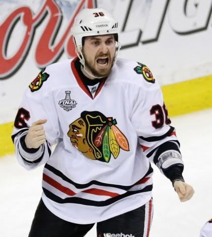
#36.) Two goals in 17 seconds.
 |
|
EKB13
Chicago Blackhawks |
|
|
Location: IL
Joined: 07.18.2009
|
|
|
|
#36.) Two goals in 17 seconds.
- Ogilthorpe2
...paging SteveRain...
|
|
philco28
Chicago Blackhawks |
|
|
Location: Mississauga, ON
Joined: 12.06.2011
|
|
|
philco28
Chicago Blackhawks |
|
|
Location: Mississauga, ON
Joined: 12.06.2011
|
|
|
EKB13
Chicago Blackhawks |
|
|
Location: IL
Joined: 07.18.2009
|
|
|
|
Yep...Wings logo is AWESOME

- philco28
This is definitely an improvement on the winged-wheel. |
|


