Of course this isn't official, but there is rampant speculation that this will be the new Sharks logo. It could be a patch, could be the crest, could be a secondary logo, could just be a prototype, but it's been leaked.
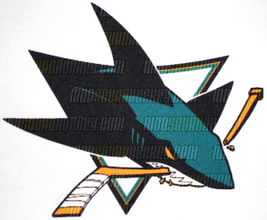
My first impression isn't great. It's kinda cool but reminds me of an Arena Football League logo. It's just too cartoony and I think the league should get away from anything that resembles a cartoon character in any way. Why is it every time a logo changes it's for the worse? The Capitals should go back to their old-school logo, the Sabres should stick to the circle, the Ducks don't even have a legitimate logo besides that ugly D, and the Kings need to stick to their old crown.
Vancouver and Phoenix are the only teams that have improved recently but I really prefer the classic, traditional logos like Chicago, Detroit, Boston, Montreal, Edmonton, Toronto, Rangers, Islanders, Philadelphia, etc. Thoughts?
[email protected]


 Join the Discussion:
»
Join the Discussion:
»