Ever since the unveiling of the black "home plate" logo in 2008-09 as the teams official third jersey there has been belly aching. In 2011-12 when the team changed the home and away uniforms to black and silver there was further grumbling. Then came the retirement of the crown logo and the royal purple last year. Groan groan groan. Now this:
ESPN: Uni Watch Power Rankings
That's right, a thread for those who hate the black and silver logo to tug on and tug vigourously. It's been a week since this blessed little gem by Paul Lukas of ESPN graced our internet browsers, and ever since there has been a reignited debate on just how bad, or great, people find the current L.A. Kings uniform.
It obviously hurts to be last in anything, but to be last in how good you look on the ice? Is there anything more arbitrary and trivial? I get it though. Who doesn't like a great looking sweater (Hockey, not argyle)? Who doesn't love a fantastic looking logo? I know I certainly enjoy the superficial things like that. There is absolutely nothing wrong with that.
But let us be reasonable here, the King jersey is by no means the worst looking in the league. If you didn't follow the link above, here's the bottom five ranked jerseys in the league according to Mr. Lukas:
26. Nashville Predators
27. Ottawa Senators
28. Washington Capitols
29. Colorado Avalanche
sigh..
30. Los Angeles Kings
Before I get to into my feelings on the jersey, which I actually love for a few reasons, let's talk about those bottom five selections.
St. Louis??? Really? St. Louis. The Blues. One of the more iconic jerseys of the last 50 years or so. Since the Blues inception into the league in 1967 the Blue note has been, in my opinion, one of the best logos out there. It correctly pays homage to the jazz tradition of the Mississippi river valley and carries with it a regal color scheme of blue and gold that has been donned by greats like Al MacInnis and Keith Tkachuk. It's a great logo. Period. No way is this in the bottom. On a personal level I'm a fan of the Senators just for the unique logo and layout the jersey has. Maybe it's not the most aesthetically pleasing, but I love the gold, red, black and white and the way it's used. Washington also has a fantastic logo that pays homage to the past while keeping it crisp and refreshing. I wouldn't be ashamed of wearing any of those aforementioned jerseys. Nashville? Too high, that mustard yellow is awful in my opinion. I just want to rub a corn dog all over the jersey everytime I see it. Never been a huge fan of Colorado either. Can someone explain to me why the hell you have a foot on your jersey? That was tough sledding from the start for the Avs though, replacing that Nordiques jersey is a tall order.
So I don't want to completely discredit the whole thing based on those bottom selections but there isn't a firmly established precedent of quality choices here. Don't even get me started on the fact that Florida, Dallas and Columbus are all in the top 15.
So let's just say I agree to disagree with ESPN on this one. Probably not the first time or the last time I will respectfully disagree with the world wide leader of football, er sports.
As for the King's logo and the fans who are and have been up in arms over it...let's break it down.
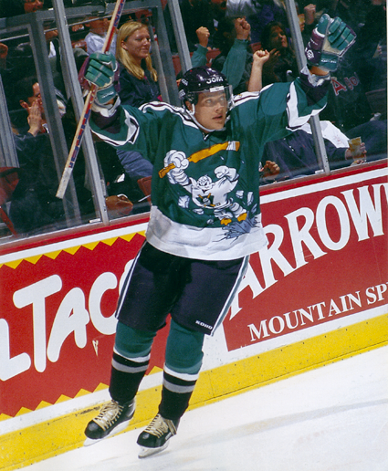
The silver and black era of Gretzky, Robitaille, Taylor, and Hrudey, is arguably one of the most memorable times and recognizable things about the Kings of said era. The silver and black chevy logo in all of the glory as well. While I wasn't a fan of the chevy logo I always did like the silver and black. Now the homeplate...that also pays homage to a logo we often forget.
This one
When you piece it all together and put the LA sign and the crown in it, I dunno it makes sense. It pays homage to two of the most memorable eras of Kings hockey with the 60's logo adorned with the slick silver and black of the 90's. Not to mention the forum blue and gold are coming back as third jerseys, all eras accounted for.
Yea maybe it's not the best thing in the world, but in Southern California in particular we've had
worse,
much, much worse.
But in the greater scheme of things does it really matter? We've come to appreciate a championship in the "home plate" logo uni's and I don't think anyone in their living room or the arena was shaking their head in dismay and muttered as Brown lifted the chalice, "If only they didn't have those damned jerseys on." Perhaps you were saying that, and if you were well that's all fine and well. We all have our own tastes in music, clothes, color schemes, tea, beer etc. etc. etc. but before you go and burn the jersey which the Kings currently don or start an internet fight over it, understand that from a historical perspective it does do a pretty good job of capturing some nostalgia from our past as well as having a flavor of it's own in the present day. Outside of that, love it, hate it, whatever. Is it hockey season yet? One more month people. One more month.
I still want to poll this and see where it goes.
How do you feel about the Kings current jersey?
I swear the Edmonton blog is coming. I keep getting sidetracked.
Hello, and welcome to movie phone. If you would like to follow Jason on twitter @SirJDL please press one now. 


 Join the Discussion:
»
Join the Discussion:
»